Redesigning the universal timezone selector
Simplifying the timezone selection across the Mindtickle platform
Type
Enhancement, Web app feature
My role
Responsible for redesigning the
component & testing the solution
with stakeholders.
Timeframe
2023 | 2 months
Target audience
All mindtickle users
Context
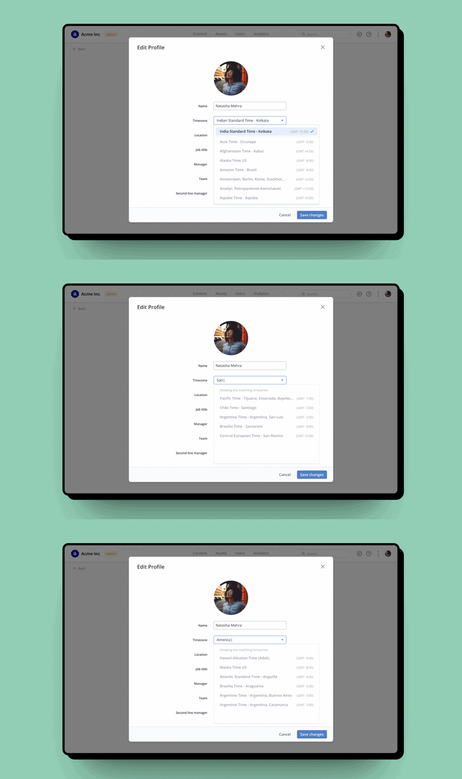
The Timezone selector is a component used universally across various products. It is utilized in more than five places in MT, but it has some limitations such as limited search capability, insufficient dropdown size, and poor user experience. To address these issues, I revamped the component to reduce error rates and enhance search usability.
The Problem
Mindtickle users want to easily select their timezone by searching with city, country, or timezone name.
Research
Understanding the universal component
I was unsure about the idea of redesigning a component that hasn't been attempted by tech giants such as Google, Microsoft, or Slack. The timezone selector is used by Mindtickle admins for various purposes such as creating training programs, scheduling invitations, creating rules, and updating user profiles.
The timezone list contained more than 500 values, and the search function was limited to timezone names only. To find an ideal timezone selector, I studied Nielsen Norman Group's research and read several articles by designers on Medium. However, I couldn't find any universal components that adhered to the insights I discovered.
Not everyone remembers the timezone value
We should highlight the timezone user is in, by default.
Search and timezone notation are critical
UTC and GMT are often used interchangeably, but city is the most common search query followed by country and state.
List should be sorted alphabetically, not timezone-wise
If users need to scroll, the list should be in alphabetical order to easily find the city or country.
ideate
Redesigning the component
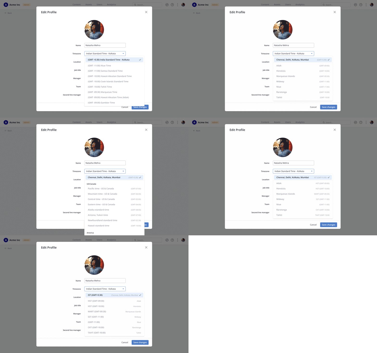
The timezone selector is a crucial feature that requires proper attention to detail in terms of the timezone values, their arrangement and sorting. Some users may not know the timezone they belong to, so it would be easier if they see the associated city or country name first. I tested different iterations by experimenting with the sorting order, such as putting the name or timezone values first. These iterations were then tested with customers to finalize which one is the easiest to use.
Solution
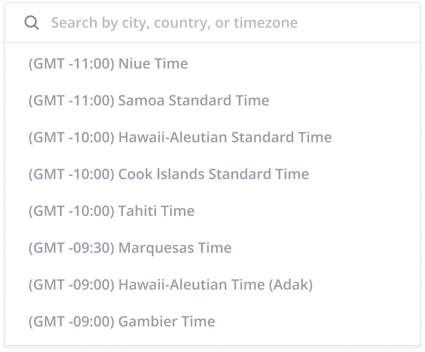
Timezone selector before redesign
The offset is usually the first thing a user sees. But this experience is based on the assumption that every user remembers or searches with the timezone offset. This list is sorted by timezone value in ascending order. Users who do not know their timezone may need to scroll through the list to find it.
Solution
Timezone selector after redesign, with an improved search, and better list
In the finalised component, the timezone name comes first. The list is alphabetical, so that a scroll can also give quick results.
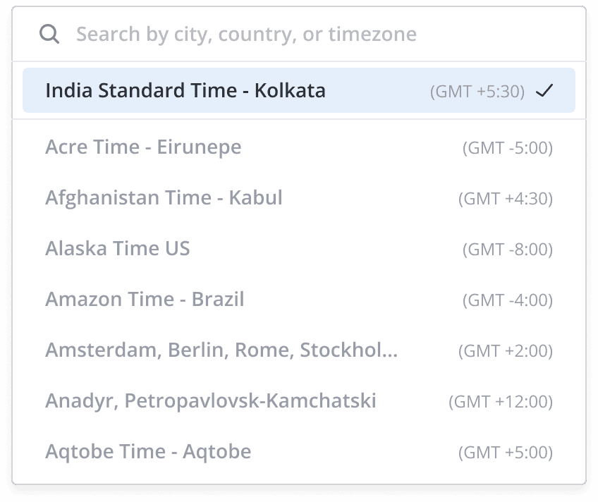
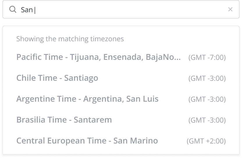
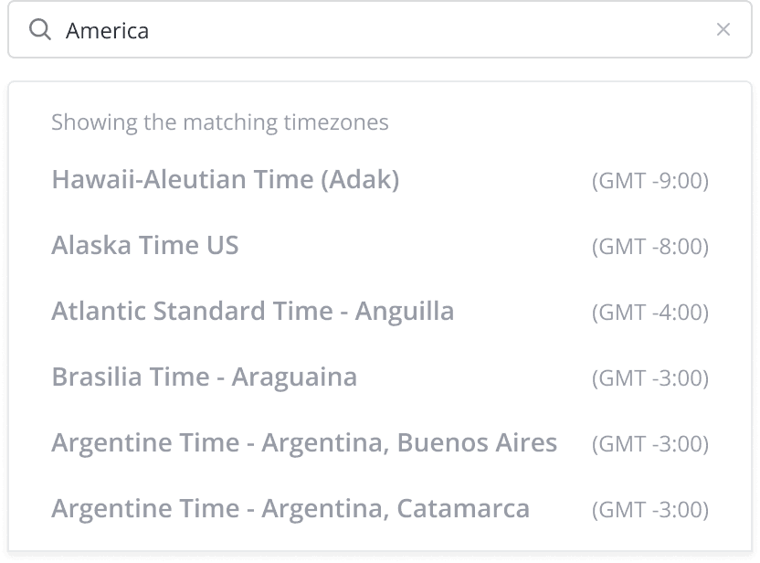
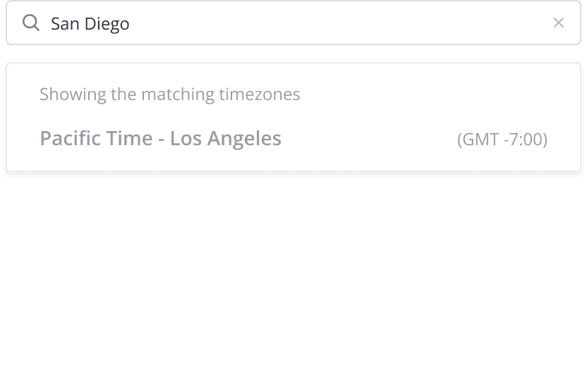
When conducting a search, an incomplete string will first match with the city name, followed by the country name, and then the timezone name. If you search for a country name, you will see all the timezones that fall within that country. Similarly, if you search for a city name, you will see the corresponding timezone for that city.
learnings
Ease of use over universality
This project gave me a different perspective on the existing designs in the world. We didn't receive any negative feedback on our redesign, so I'm glad that we were able to challenge some preconceived notions.
I realized that even small things like the order of placement or sorting can greatly impact the overall user experience of a component, particularly when used on a large scale.
Being a part of the platform team took on a whole new meaning for me after working on this project.
Thanks for reading!